Often we hear that responsive design and mobile optimization in general is a must do for B2C marketers but unnecessary for B2B marketers.
The thinking goes something like this: people buying for business purposes, as opposed to shopping for themselves, mainly search out products and services during work hours, when they have a desktop computer at hand.
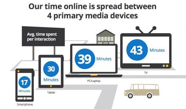
This is dead wrong. In fact, we are finding that the use of smartphones and tablets is actually changing when people convert. It use to be that most of conversions came in from 9 to 5. Now we find that with 40% of traffic coming from mobile phones, more conversions are happening at 8PM and later.
Smartphones have reached a tipping point, with 50% of mobile phone subscribers in the US carrying a smartphone – either iOS or Android. And analysts expect a full 80% of mobile subscribers to carry smart phones by 2016.
A recent study from Adobe (as reported on Forbes) concluded that tablets account for just as much web traffic as smartphones.

Other things you should know about mobile.
- If you sell eCommerce or do lead generation, it is typical to find that mobile conversion rates are higher than those you’ll see on the desktop
- Mobile is changing the time of day when conversion happens. Mobile visitors to your website are much more likely to convert in the evening.
(Source: DM News 2013).
So, we’ve got to ask. Are your websites optimized for mobile?
Here are 6 steps you need to follow to find out:
1. Make it quick
We are impatient when we’re on mobile devices. Nearly 60% of web users say they expect a website to load on their mobile phone in 3 seconds or less and 74% are willing to wait 5 seconds or less for a single web page to load before leaving the site. 50% are only willing to wait 5 seconds or less for an application to load before exiting. (Gomez 2011 – Registration Required).
This is probably because search is the top activity on mobile devices. In fact, one half of all local searches are being performed on mobile devices. People search for information on the go, and they want that information IMMEDIATELY.
So you have just a few seconds to load your site before an impatient user will abandon it. Make sure your performance test so that your pages load lightening fast.
2. Simplify your user navigation
If your site isn’t optimized for mobile, your buyers will likely click away thanks to a poor user experience. Worse, they may think less of your brand. A recent U.S. Study by Google of over 1,000 mobile phone users reported that 52% of visitors would not engage with a brand after having a poor mobile web experience (Google 2012).
Use responsive design so that on a smart phone your website displays in one column and on a tablet computer in 2 columns (portrait) or 3 columns (landscape). Remember that anything on the sidebar of your site will be forced down to the bottom of the column on a smart phone and – depending on your layout – tablets and plan accordingly.
3. Rethink Your Calls To Action (CTAs)
Make your calls to action (CTAs) have to look like buttons and be easy to tap.
(Remember smart phones and tablets have a touchscreen … which means there is no such thing as a mouseover on these devices.)
We think people are starting to get trained to look for valuable offers and calls-to-action at the bottom of the column on a smart phone. An eye tracking study by Google of German mobile phone users in 2011 says otherwise.
Other tips to get visitors to take action on your web content from a smart phone or tablet:
- Text links – underline them and/or up the contrast with color
- Fonts should be big and white space is your friend.
- Remember to include ‘Back’ and ‘Next’ buttons
- It should be obvious what each button does
A popular book on web usability is entitled Don’t Make Me Think. This is especially true on a smart phone and tablet.
4. Mobilize Your Forms
Web pundits sometimes think cookies are evil (at worst) or an invasion of privacy (at best). That said, on smart phones and tablets, you’ll want to lean on cookies heavily.
Cookies allow data to pre-populate on a form if it’s been entered before.
Prospects are hopelessly lazy in the face of time-consuming forms … even on desktops. On mobile devices, it’s even worse! Make it as easy as possible. Use dropdowns for selections. Aim for as little data entry as possible.
5. Optimize emails
Recent research from MarketingSherpa (2013) found that only 21% of marketers are integrating mobile with email. This isn’t great when you consider that when it comes to using smartphones and tablets, people are checking emails more than they browse websites or use social networks.
In fact, an IDC survey in the US found that 78% of respondents check email on their smartphones, compared to 70% who browse websites and 70% who do something on Facebook. (Return Path).
Consider timing. Mobile email readership is at its peak on Saturday, and at its lowest on Monday (Marketing Technology Blog 2012).
6. Encourage People to Share Your Content
When people share your content on Twitter, LinkdedIn, or Facebook they are endorsing your company in a way that is invaluable to you.
The connection between mobile and social sharing is clear. Consider that 91% of mobile internet access is for social activities, versus just 79% on desktops (Microsoft Tag 2012). In fact, while social networks account for 27% of time online from overall, they account for 15% of time spent on a mobile device browsing the web.


